Wednesday, 30 November 2011

Vehicle

For my second brief i chose the Vehicle brief as i thought it would be what i would be best at. I also wanted to try a vehicle again after my last proper attempt in first year. This time i wanted to do something different to land. i settled on the idea of an aircraft as it was different and physically interesting yet simple enough to do well in the time i had.


I was thinking of cool unique aircraft keeping in mind that if i needed reference i could get some.
I found that down in London they had a scale replica of an F-35a Jet soon to replace the harrier for vertical take-off aircraft. Its still in concepting and at the moment i believe there are 3 varients but i was doing the A class.

Thursday, 24 November 2011

Sky

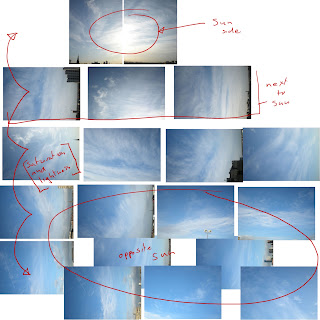
I wanted to make my own vibrant sky to go in my level and found a really good tutorial to do so. It also includes sun set up and rolling clouds.


Sky ref

sky panorama to polar co-ordinate sky map

The material details for the sky. Mad.

 The vibrant colours to go with a strong orange and blue theme.


Wednesday, 23 November 2011

Fence


The fence i made was wire and was to have dynamic tarp hanging from it. This was hard to set up and involved using the abandoned ActorX feature in max. With some playing around i got them to blow as if attatched to the fence. This adds life to the level and i think is the coolest part of the design.

Tuesday, 22 November 2011

Decals

  This smiley face added to the character of the level and gave the ever so generic water tower an interesting feature.
 I also made some generic dirt and muck to spread over my level and break up the tiles.
 This was a last minute design which filled out a blank wall in my level. Its an old fashioned painted sign, possibly from an old company that owned the building before.

Monday, 21 November 2011

Transformer

I needed something to pad out my level, this part wasn't thought up in the concepting stage but i thought something big and chunky would fill out my level a bit.


It was also a good thing to put in my cordoned off area of the map as AC units would not look as good behind fencing.


Friday, 18 November 2011

Thursday, 17 November 2011

Wall trim


The wall needed some kind of trim  to go around the top of the roof. i created something that would sit on the already constructed bsp and overlap to create boarders on both sides of the wall. I also made it modular with a straight, out facing corner and  in facing corner piece. 

Here you can see the inside of the wall trim and how it gives the impression of a concrete slab over the top of the wall.

Wednesday, 16 November 2011

Stairs


Local reference


I created modular stairs based on some i found. They consist of a corner, straight and elevated steps. Each fits together with one another and can be built in any shape. All i had to do was to build them to fit.


Tuesday, 15 November 2011

UPDATE: AC Units

 Showing the finished AC Units.

The fan on top was modular and could have its materials partially altered to attach to the vents.

Doors and windows

Windows
   
   For my windows i noticed some local ones that looked like they would fit my building nicely. They also had two varients, an arched  one and a straight one. I liked the idea of insetting them like this too.

To make these i made the texture sheet first and after applying it to a plane in max i could extrude and inset around the windows. This was a simple method and saved time on unwrapping. I think they also tile pretty well.


Door
       This door i found looks like it belongs on a roof but was far too dirty and vandalised for what i wanted.


The result after cleaning up in photoshop and adding decals.


Monday, 14 November 2011

Friday, 11 November 2011

UPDATE: Pipe


The pipes have now been textured with a cool blue paint job to go with the blue and orange colour style. The texture has a weathered wear across the top of them and tiles nicely around the level. I've done a small arrow decal down the side of them giving them a more of a purpose.

Thursday, 10 November 2011

Floor


   I was origionally going to do basic tiled flooring throguhout my level but i quickly came to see this would be boring. Looking at other rooftops i found that several had gravel areas where machinary like air conditioner towers were stood on stilts. Areas where people would walk were paved with tiles to make it easier to get around. i thought if i incorporated this design it would break up the floor and give more interest in the level design. It also partially guides the player around the level.


 These are examples of the flooring i wanted. You see in the bottom one that the unit is surrounded with paving but sits on gravel.


 Here i have tiled the gravel and had that as a base then cut into the BSP mesh and raised areas of tile around the rooftop units. the tile size is good and has no clear tiling pattern but needs to be dirtied with decals later.